RESPONSIVE DESIGN
Responsive web design (RWD) is an approach to web design which makes web pages render well on a variety of devices and window or screen sizes. Recent work also considers the viewer proximity as part of the viewing context as an extension for RWD.
Content, design and performance are necessary across all devices to ensure usability and satisfaction.
A site designed with RWD adapts the layout to the viewing environment by using fluid, proportion-based grids, flexible images and CSS3 media queries
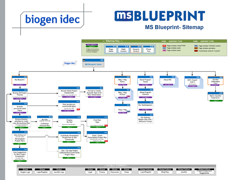
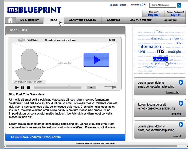
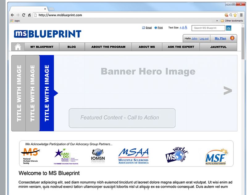
Client: CGI Health/Biogen idec - MS Blueprint

Client: Spectrum Cummunications - Navigation Redesign